We’re a Design for Experience Awards Finalist! Woo hoo!
Every year The International Design for Experience (DfE) Awards program recognizes people, teams, products, and services that have achieved success in the field of experience design―and this year Zoosk’s User Experience team (hey, that’s us) was one of those recognized!
We’re very happy to be one of the DfE finalists for Effective In-house Team. Over the past year, we’ve had some major successes that were a direct result of our culture of open collaboration and experimentation, and we’re excited to share some of the things that have worked for us with the larger user experience community.
Check out our awards gallery page to view screenshots of our recent projects and learn about how we’ve designed our team. And while you’re there, we recommend taking a look at some of the other categories and winners too.
To help give you a good idea of the types solutions we’ve been working on, here’s a short overview of the projects we submitted for the awards:
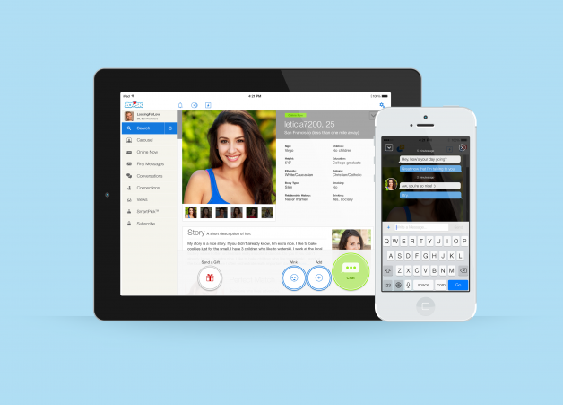
Connections Page for All Devices
The Connections page on Zoosk is where users go to accept connection requests or initiate conversations with people they’ve interacted with before. The main goal of our update was to create an experience that would increase the number of accepted connections. By simplifying information and presenting requests in a way that was more manageable for our popular users, we were able to come up with a minimalist design that presented a streamlined experience and resulted in more connections.
Top Navigation for All Devices
Zoosk’s new navigation started as a platform problem and the solution we found worked so well we ended up implementing it across all our devices. While implementing the Android action bar, we were limited by the number of actions we could have in the top navigation and had to scale down. We combined two of our navigation items that had similar goals from the user’s perspective into one “Promote Yourself” pop-up item represented in the navigation as a single icon. Even though both actions were no longer given a high-profile spot in the top navigation, by pairing them together they both grew in popularity.
Responsive Homepage for Web
Zoosk’s old homepage was a simple form page that was ineffective and failed to communicate our brand. While rethinking the new page, we were pretty open as to what we could do and wanted to bring in other teams for their ideas. The animation and responsive nature of the site is a result of a close collaboration between UX and engineering.
Settings for Web
Updating the settings section was a huge step forward in terms of getting rid of the remnants of older designs still on our site. However, before we could revisit the design, we had to take a step back and work on the information architecture. Because each settings category had different functions and goals, each page had to be different. The UI designer on the project worked closely with the product team to make information extremely findable, and the result is a settings section that’s intuitive and effortless.
More From Megan Murray: