You’re Not Funny, You’re Just Annoying – How and When to Use Humor in UX
Humor can be an amazing tool. It can add a touch of fun and whimsy to an ordinarily mundane situation. In UX, it can transform a mediocre experience into something delightful.
And, like anything else, it can also fail miserably.
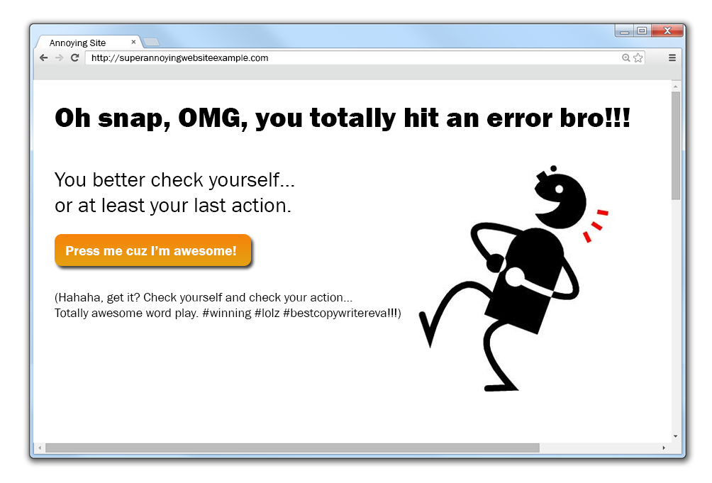
Many of us have experienced annoying, even frustrating, uses of humor—and not just in a lame TV show or er… a well-meaning blog post. Maybe you’ve had an experience where you couldn’t load a page or were logged out of a site while in the middle of something, and you got a message like this:
Ut-oh, looks like you did something wrong.
You left us! Come back, we still love you!
Oopsies! Your request timed out!
Oopsies? Really? Ugh, so annoying.
Recently, I’ve noticed a rise in the number of sites and apps using little bits of humor in their content. And, don’t get me wrong, I like a good laugh. The writer in me loves seeing people think creatively and tell a joke or two. The content strategist in me just wants to make sure they’re doing it for the right reasons.
Because, all too often, humorous content is written for the writer, not the user. (Let’s be honest, we’re creative people and it’s understandable to occasionally get bored with naming buttons or writing FAQs.) But if you use humor the wrong way, it can send the message that you’re more interested in showing off for your user than you are in actually helping them.
So how can you make sure you’re using humor for the right reasons?
Here are four simple questions I came up with to help you decide if humor is right for your design …
1. Does it fit the experience?
In her great post on emotional design, Sabina Idler reminds us that Context of Use is one of the main elements that forms the foundation of any good design. When considering adding humor to a design, it’s important to think about what emotions are involved and what your users may be feeling as they complete a task or move through an experience.
When you add humor to an everyday task people often feel more positive about it. Humor makes people feel comfortable and at ease, and can help you create experiences that are enjoyable and memorable.
MailChimp is a great example of this. Email marketing experts set up and send a lot of emails on a daily basis. Small pieces of humor, like calling an email send a “moment of glory,” or adding a fun message to the top navigation (“Hi, Megan. New shirt? Very nice.”) can help make users’ daily tasks just little bit more enjoyable without distracting them from what they’re trying to accomplish.
But there are definitely times when humor doesn’t fit the use case. If you have serious content it deserves serious treatment or your users won’t take you seriously. Situations like canceling a subscription, receiving an error, or asking for help are not the best times to start cracking jokes. Nobody thinks it’s funny when their credit card is rejected, they lose work, or have to repeat something they just completed.
If the context you’re designing for already has the potential to frustrate your user, be careful about adding humor into the mix. You may be confusing your message by making your user think you don’t take them or their situation seriously. And the last thing you want to do is add to their frustration.
2. Does it fit your users?
Think about your users and what their goals are. Are they older or younger? Are they using your service for personal or professional reasons? Is visiting you something they want to do or have to do? The answers to these questions may help guide your decision.
BarkBox, a company who sends subscribers a monthly box of fun toys and goodies for their dogs, is another great example of someone using humor in an effective way. They know their users are dog-lovers who invest money in toys and treats that make their pets happy—chances are these users are going to be very receptive to Puppy Feeds, ruh-rohs, and fun word play about begging, barking, and scratching that itch. They probably even expect it.
Just as treating a serious situation humorously can result in a negative experience, so can treating a fun situation with too much gravity. If your users expect a little fun and lightheartedness, give it to them! Cicero famously said, “If you wish to persuade me, you must think my thoughts, feel my feelings, and speak my words.” Though none of us are arguing points of Roman law here, we are getting inside the hearts and minds of our users. Thinking about who they are and communicating with them in a voice that reflects their own, will help you connect with your users and strengthen your designs.
However, as a word of caution, I want to remind you that being funny is hard. Not everyone has the same sense of humor, so any time you add humor to your design you need to be prepared to alienate or annoy at least some people. Even MailChimp has realized that all their users don’t appreciate jokes in their UI, so they added a Party Pooper Mode to turn off the site’s jokes. That means, even a brand that utilizes humor consistently and effectively, has users who don’t enjoy the jokes and just want to get their job done.
3. Does it fit your brand?
Sometimes humor can be a great way to stand out in a busy marketplace and create a strong voice for your brand. Messages that use humor are seen as more memorable and impactful than those without. Humor can give your product personality and a humanness that people respond positively to.
There are a lot of food delivery apps out there but when Eat24 came on the scene, they stood out because of their flippant messaging and fun approach. Ordering food should be a delightful experience but it’s often wrought with challenges (we’ve all had an order that was wrong, late, or mixed up). Adding humorous waiting state copy about boiling potatoes, curling fries, lading soup; or making a joke about forgetting a password because, “Hunger affects memory in mysterious ways,” can make potentially unpleasurable situations more bearable.
There are a lot of brands that use humor in almost every aspect of their content. And the reason it works is because of who they are. Cards Against Humanity, Foot Cardigan, or Hipmunk are all examples of people who use humor almost everywhere, even in situations where other brands just couldn’t get away with it.
So what do you do if your brand and your product isn’t very funny? Assess the situation a bit more. Having a Super Bowl ad with a talking baby is one thing, but imagine if E*TRADE’s entire service used humor in their site copy, error messages, and menu names. Not only would it get annoying but it would send the wrong message about their content. They aren’t Eat24 and they don’t try to be. Understanding who you are as a brand can help you make intelligent decisions about when and where it’s appropriate to use humor in your design.
4. Does it add anything?
In my opinion, this is the most important question—is humor adding anything to your design or is it just there? After thinking through the considerations above, this should be the final thing you ask yourself. Humor can help you better illustrate a point, put someone at ease, add a sense of fun or delight, or create a voice or tone your user can relate with. But if your use of humor isn’t doing any of these things, then you may want to cut it out. Humor, like all of your content, should serve a purpose.
It’s also good to remember that just because something’s funny doesn’t mean it’s going to work. Because you know what’s not funny? Seeing a drop in click-throughs because you thought it would be fun to add Oh snap! to your copy. Or trying to explain to your boss why you used the phrase major bummer in an error state and not knowing what to say. Humor can be an amazing tool to make your design both usable and pleasurable, but like any good shop student will tell you, use the right tool for the right job.
Resources and Further Reading
MailChimp Style Guide and MailChimp Voice and Tone Guide
Not Just Pretty: Building Emotion Into Your Websites
Sabina Idler writing for Smashing Magazine
Humor-Centered Design (SlideShare)
Chelsey Delaney presentation for LeanUX NYC 2013
Emotional Design: Why We Love (or Hate) Everyday Things
Donald Norman
Technologies That Make You Smile: Adding Humor to Text-Based Applications
Mihalcea, Rada, and Carlo Strapparava for Interactive Entertainment (2006): 33-39
More From Megan Murray: