UX Roundup – Responsive Icons, Atomic Design, and Making Things Dirty

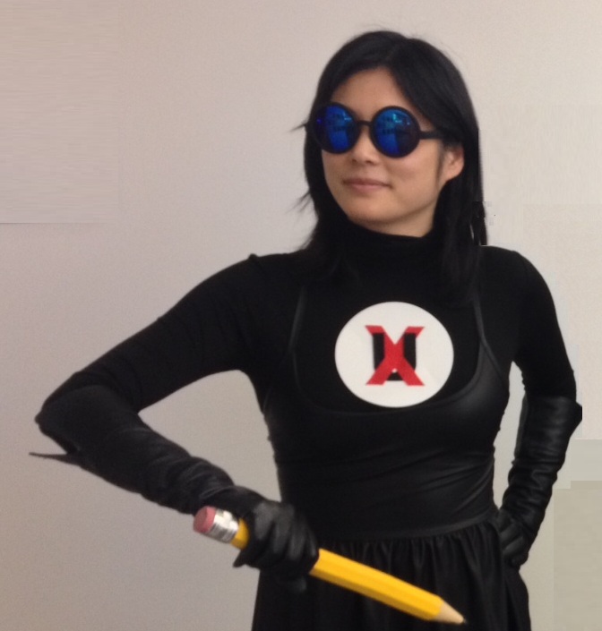
UI Designer Charmagne Kringstein as one of members of the elite crime-fighting team UX-Men. Additional Note to This Caption: The designers would like you to know that the Content Strategist (aka writer) edited this photo using Microsoft Paint and that it does not reflect the high photo-editing standards of the rest of the team.
Great ideas can come from a lot of different places—from watching someone use an app on the train or seeing a new art exhibit, to an article that gets passed around the office or a design portfolio that you found especially creative.
At Zoosk, we take our inspiration from a lot of places and are always looking for new ideas that can improve what we do. As an ongoing part of our UX blog, we’ll be featuring a roundup of all the tools, articles, art, examples of great websites, and random inspiration that we stumble across while doing our work. Enjoy this week’s links and make use of some of the tools we’ve found helpful.
Tools and Resources
Pattern Tap Gallery – The Main Tap
A nice resource for interaction design patterns. And it actually showcases them using some pretty good visual design.
Responsive Icons Collection – Iconic
If you’re thinking of using responsive icons, this collection from Iconic shows some good examples. Click on an icon to see a set of three icons then toggle back and forth to see the subtle differences in design that can make a big difference.
Experimental Interaction States – Tympanus
This collection of solutions to different web development challenges is worth taking a look at next time you’re stuck. It includes articles, plugins, and experiments.
Articles and Blog Posts
Atomic Design – Brad Frost Blog
A great article explaining the atomic design methodology for creating design systems. (It sparked some good debate in the office this week. Especially the comment that things like color, typography, grids, and texture are subjective aspects of design.)
Quotable Moments (or lack thereof)
“Let’s get back to our roots… Make things dirty, see if it works, then clean them.”
“It’s pretty beta at this point.” “You’re pretty beta at this point.”
“It’s about the entire experience, it’s not just what you see on the screen.”
“You design for a purpose, you’re not designing for yourself.”
“Sometimes I feel like 50% of design is color.”

